

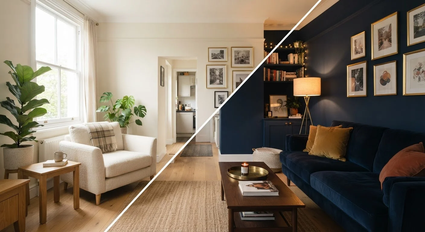
The Rule Everyone Repeats — and What Research Actually Shows
Ask almost anyone how to make a small room feel bigger and they'll give you the same answer: paint it white, or at least something light. This piece of advice is repeated so consistently that it has taken on the status of a decorating law. But the evidence behind it is more qualified than the rule suggests.
What is well-supported is that lighter colours with higher light reflectance value (LRV) — a measure of how much light a surface bounces back — do increase a room's apparent brightness. More reflected light generally helps a space feel open. The problem is that spaciousness and brightness are not the same thing. A room can feel bright but still feel small if its walls clearly define tight boundaries, or if high contrast between surfaces makes every edge more visible.
Environmental psychology research has consistently found that perceived room size is influenced by multiple overlapping factors: luminance (how bright surfaces appear), contrast patterns, ceiling height, and even how much furniture is in the space. Wall colour is one input among several — not a master switch.
“Colour does not exist independently of its context. The same hue can advance or recede, warm or cool, expand or compress — depending entirely on what surrounds it and how it is lit.”
— Josef Albers, Colour theorist and author of 'Interaction of Color'
What Dark Walls Actually Do to a Space
Dark wall colours carry a reputation for making rooms feel smaller, and in purely geometric terms there's logic to this: darker surfaces absorb more light, which can make walls appear closer than they are. But the story doesn't end there.
When dark walls are paired with similarly dark or low-contrast furniture and trim, the room's visual boundaries become less defined. The eye doesn't jump from wall to sofa to floor in sharp contrast — instead surfaces blend, and the room can feel less boxed-in rather than more. Interior designers have long used this technique in small dens, reading rooms, and bedrooms where the goal is intimacy rather than the illusion of openness.
There's also a practical side: dark walls tend to hide scuffs, fingerprints, and uneven surfaces better than white or pale alternatives. In a rental where wall conditions aren't ideal, this is a real consideration. See our exploration of how visual clutter amplifies perceived stress for more on how contrast and visual noise affect how a room feels.
LRV 0–100
Scale used to measure paint reflectance
Light Reflectance Value (LRV) is an industry-standard metric; a value of 0 is pure black (absorbs all light) and 100 is pure white (reflects all light), though no paint achieves either extreme in practice.
~55%
LRV of a typical mid-tone grey
A standard mid-tone grey sits around LRV 50–55, meaning it reflects roughly half the light hitting it — enough to feel balanced without the clinical brightness of pure white walls.
2,700–3,000K
Warm bulb colour temperature range
Bulbs in the 2,700–3,000 Kelvin range emit warm, amber-toned light that shifts cool wall colours toward grey and warm colours toward orange — a key factor when testing paint samples under artificial lighting.
The Variables That Matter More Than Colour Choice
Before reaching for a paint colour, three factors deserve priority attention:
Natural light levels
A north-facing room with limited natural light will absorb a pale colour differently than a south-facing room flooded with afternoon sun. In low-light rooms, even very light colours can read as grey or flat, while a warm mid-tone may feel more alive. Evidence-based strategies for improving natural light should inform your colour decision before anything else.
Ceiling height and treatment
Painting a ceiling slightly lighter than the walls is one of the most effective ways to suggest height — more so than changing wall colour entirely. A ceiling that matches the walls exactly can feel lower; one painted in a clearly lighter tone pulls the eye upward. If you have the option to paint, this is often where colour does the most work per square foot.
Contrast and visual boundaries
High contrast between walls, trim, skirting boards, and furniture makes every edge more visible, which tends to emphasise the room's physical limits. Reducing contrast — matching trim to walls, choosing furniture that doesn't dramatically stand out — can soften boundaries and make the room feel less defined and therefore larger. This matters regardless of whether your walls are light or dark. You may also find useful perspective in our look at what actually works for mirrors and spatial perception.
How to Test Before You Commit
Paint samples on small chips are nearly useless for predicting how a colour will behave on a full wall. The only reliable approach is to test a large swatch — at least 12 inches by 12 inches — directly on the wall, and observe it at multiple times of day and under artificial lighting.
A colour that looks warm and inviting at noon in direct sun may appear greenish or grey in the evening under LED lighting. Observe the swatch when the room is naturally lit in the morning, in the afternoon, and after dark with your actual bulbs on. This is especially important in rooms with limited windows.
Test Paint in the Actual Room
Paint a section of wall at least 12 inches square and observe it across morning, afternoon, and evening lighting before committing. A colour that reads beautifully in natural daylight can shift dramatically under warm or cool artificial bulbs. This single step prevents the most common and costly paint mistakes in small spaces.
It's also worth stepping back and considering how using vertical space strategically can complement your colour choices — particularly if you're weighing options for a narrow room where height matters.
This article is for informational and educational purposes only. Results will vary based on individual room conditions, lighting, and materials. Always test colours in your specific space before committing to a full paint job.
Frequently Asked Questions
Not always. Light walls do reflect more light, which can make a room feel airy, but in rooms with little natural light the effect is limited. If furniture and decor create high contrast against light walls, the eye picks up boundaries quickly and the space can feel more cluttered rather than larger.
Yes, under the right conditions. Dark walls with low contrast to furniture and trim can blur the room's edges, making its boundaries feel less defined. In small rooms used as cozy dens or bedrooms, this effect is often welcome rather than oppressive.
Painting the ceiling slightly lighter than the walls is a widely used technique to draw the eye upward and suggest more height. Conversely, a dark ceiling can feel dramatic but will compress perceived height — which may suit a bedroom but rarely works in a narrow hallway.
Yes. Matte finishes absorb light and soften edges, which can make a room feel calmer but slightly smaller. Eggshell and satin finishes reflect a little more light, gently amplifying the room's apparent brightness without the harshness of a high-gloss finish.
Ideally after, or at least simultaneously. The contrast between your wall colour and your largest pieces of furniture has a significant effect on how the room reads. Choosing colour in isolation often leads to results that don't match what was expected in the paint sample.
Choosing colour based on tiny paint chips under store lighting rather than testing a large swatch in the actual room at different times of day. Room orientation (north- or south-facing) and the quality of natural light dramatically change how any colour reads on a wall.
The content provided on our blog site traverses numerous categories, offering readers valuable and practical information. Readers can use the editorial team’s research and data to gain more insights into their topics of interest. However, they are requested not to treat the articles as conclusive. The website team cannot be held responsible for differences in data or inaccuracies found across other platforms. Please also note that the site might also miss out on various schemes and offers available that the readers may find more beneficial than the ones we cover.